LoGO DesIGN.
A few pages from my sketchbook.

OK, so essence of Chip; my initial ideas were centered around a perfume or aftershave type packaging. Essence Of Chip would smell like a mixture of tabac, amber and sandle wood hopefully.
The Treebus comment is my self description comparing myself to compulsive horder and hero of the Life Of Grime tv series Edmund Treebus. My hoarding connects with my urge to upcycle, recycle and reuse found materials. I wanted to use some found materials in this project.
Another page of early ideas, still playing with the aftershave idea and the branding it Chi(p). There are a few notes about Chi and a couple of rough ideas for a pictogram of a dragon using the the letters chip, although they ended up looking like ducks. The orange stain is from the curry I was eating whilst working, it blends in quite nicely into the matchbox drawing.

Several non-starters here , but one struck me as having some potential,


I worked up this rough, but more logo like version. It reminds me of a bacardi logo.
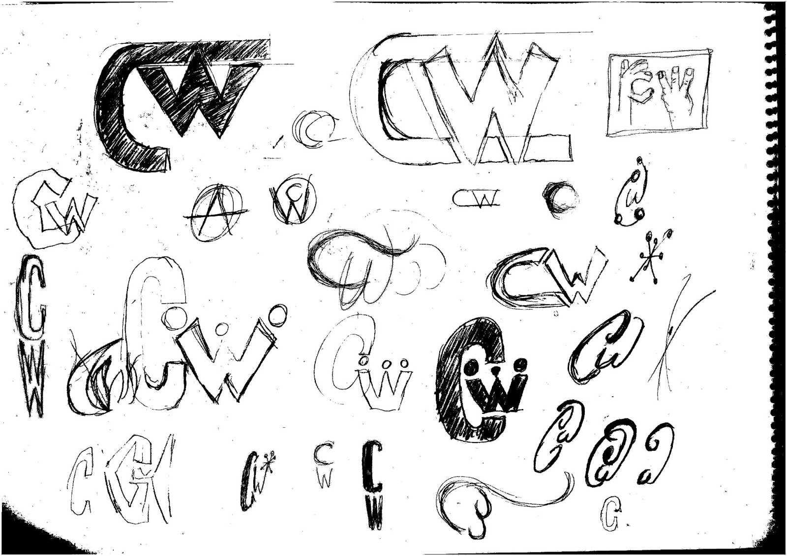
 There are quite a few on here that I like. The flowing Cola style logo is a particular favourite, but as I say, it's very similar to the Coca Cola logo.
The sketch on the lower right of the center, with the C and crown W, I thought had potential.
Below are some variations on this idea.

Working on the idea.


Another variation.
No comments:
Post a Comment